Risk Radar
6-dimension health visualization
Overview
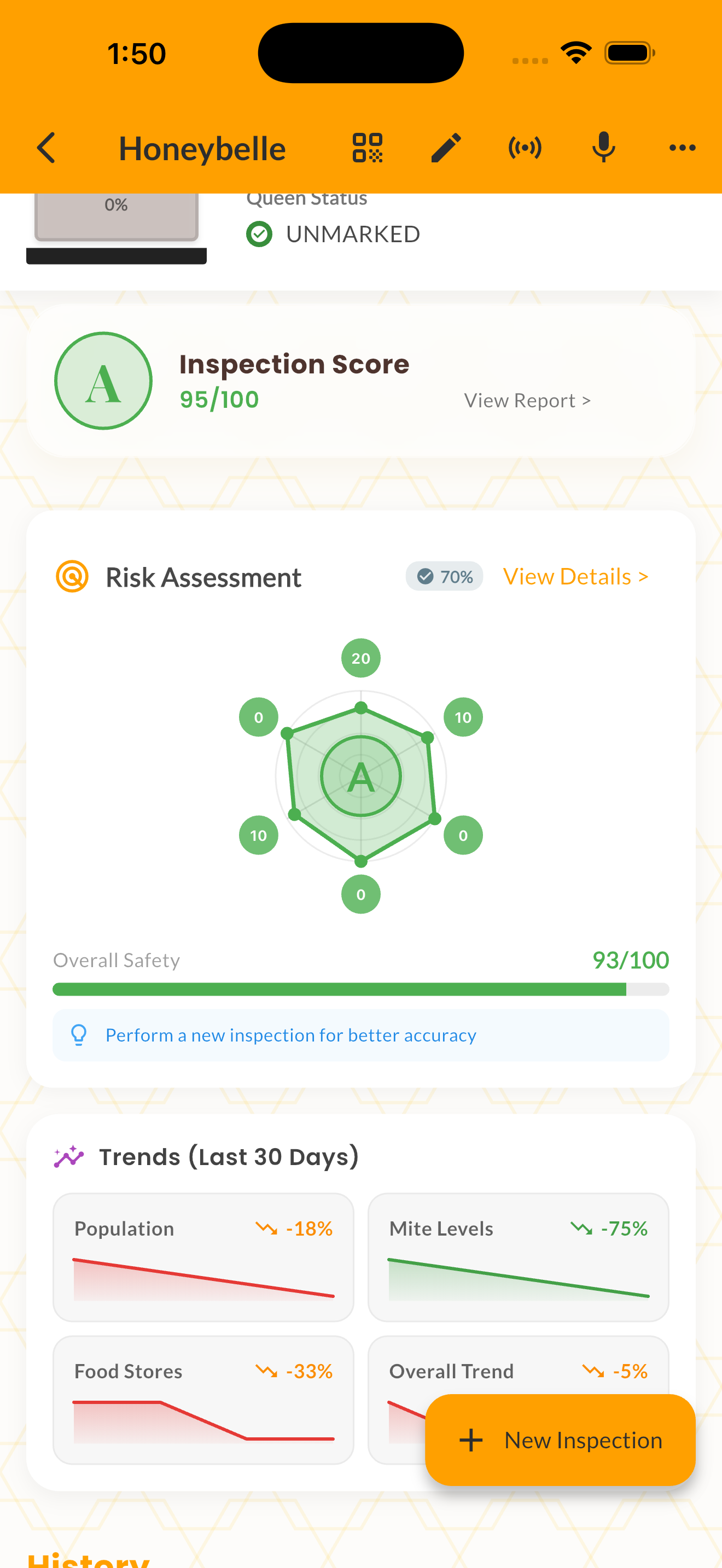
Risk Radar provides a 6-dimension health visualization for each colony. The radar chart plots starvation risk, varroa pressure, queen health, swarm likelihood, winter readiness, and disease exposure on a single, easy-to-read graphic.
Each axis is scored from 0 (no risk) to 100 (critical), with color coding from green through amber to red. The chart updates with each inspection, giving you a visual history of how risks evolve over time.
Risk Radar also includes a data confidence indicator that tells you how much the score can be trusted based on the recency and completeness of your inspection data.
How It Works
Open any hive and navigate to the Risk Radar section.
Review the six risk axes — higher values mean higher risk.
Check the overall grade (A through F) for a quick summary.
Tap any axis to see what's driving that particular risk score.
Tips & Best Practices
- 💡Focus on the axes that are in the amber or red zone rather than optimizing green ones.
- 💡The "Top Concerns" list below the radar prioritizes what to address first.
- 💡A low data confidence score means you need more recent inspections for accurate risk assessment.
- 💡Seasonal context matters — a moderate winter risk score in spring is less concerning than in autumn.